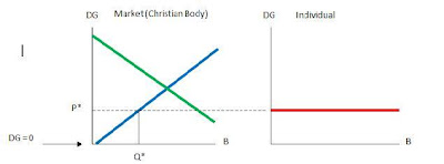
I came up with this a few years ago. I'd like to discuss / correct anything on it if anyone disagrees. This chart is what I would propose to be the economic representation of our giving as Christians. The DG on the y-axis represents Difficult Giving. The giving does not necessarily mean monetary. This ranges from your tithe and involvement in your church body to the sacrifice of giving your life to His ministry. The B on the x-axis represents the blessings that God gives to us. I want to note that the graphs are not mapping the ratio of God’s blessings to our giving. I understand that we receive all that we will ever need of God’s grace and blessing at DG = 0, because that is simply given to us, and we can not earn it. There are different variations that I will talk about, but this first graph, in my own opinion, is charting Christians as a whole.
The blue line represents our market giving, and is simply a supply curve. I believe the line would be more of a curve (instead of the straight line that is presently showing), and probably in a manner that the ratio of Difficult Giving to Blessings is very low, because we can not out give God. For our graphical purposes, I have made the line positive, because by giving more, we ultimately receive more (I do not mean monetary exclusively, this is not supporting giving more so that we can have that fancy SUV or $1 million home)
The red line represents the individuals in relationship to the market, or entire body of Christians, of our giving. As you can see, the dotted line is connecting the red line to the blue line. This is not a coincidence, and I did not just make it up – it is a derivative of individual and market economic theory that remains to be disproven by the great minds of John Forbes Nash and others. The dotted is linking the market to our individual supply of giving. I would like to note that some will give more, but overall, according to the economic theory, we are only going to give up to the point of (P*,Q*). You will also see that the market or red line is a flat line. This is because we are willing as a whole to pay one price. This one low price is the amount that we would pay regardless of the amount that God is willing to bless us with. This is our sin. Due to our sinful nature, no matter how many blessings God is offering us, we are not changing and giving more. This thought is proven on a daily basis, for God has offered the world the ultimate blessing through the ultimate gift. However, we will never be willing to give at the point that God demands.
The green line represents the demand of God. The first thing that you should be seeing is that our willingness to give is only (P*,Q*), and that we are falling short of God’s demand. God wants us to be giving where the blue and green lines cross. A triangle is formed from our lack of giving. The triangle consists of the dotted line as a base, and the blue and green lines as sides to the point that they meet. This area should be viewed as a loss to God. Not that He could ever lose anything that he wanted, but it represents the area by which we fall short to God’s demand. This amount, if ever quantifiable, is how much more we owe Him.
In the end, this is not a cutting edge thought or a new discovery. I just think it is a great representation of our sin, our giving, and God’s demand.
WOW OK
ReplyDeleteWhy should I keep posting?
ReplyDelete